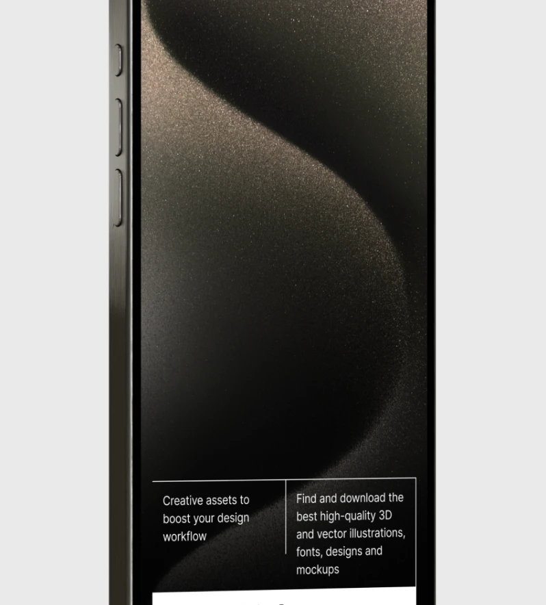
The Art of Typography in Web Design: Tips and Tricks
The Art of Typography in Web Design: Tips and Tricks
The Art of Typography in Web Design: Tips and Tricks
The Art of Typography in Web Design: Tips and Tricks
Design
/
Samuel Kovatski
Design
/
Samuel Kovatski
Design
/
Samuel Kovatski
Design
/
Samuel Kovatski

Source:
Samuel Kovatski
Typography is not just about choosing fonts – it's an art form that can elevate your web design from ordinary to extraordinary. In the digital realm, where content is king, mastering the art of typography is essential for creating visually appealing and engaging websites. In this article, we explore the principles, tips, and tricks for leveraging typography effectively in web design.
1. Understand the Fundamentals
Typography encompasses various elements, including font selection, size, spacing, alignment, and hierarchy. Understanding these fundamentals is crucial for creating visually harmonious and readable designs. Start by familiarizing yourself with different font categories (serif, sans-serif, display, etc.) and their characteristics.
2. Choose Fonts Wisely
The choice of fonts sets the tone for your website's personality and message. Select fonts that align with your brand identity and the overall theme of your website. Aim for a harmonious combination of fonts for headlines, body text, and accents, ensuring readability and visual consistency across different devices.
3. Establish Visual Hierarchy
Establishing a clear visual hierarchy guides users through your content and helps them prioritize information. Use different font sizes, weights, and styles to distinguish between headings, subheadings, and body text. Experiment with font hierarchy to emphasize important content and create a sense of flow and organization.
4. Pay Attention to Readability
Readable typography is essential for keeping users engaged and ensuring they can consume your content effortlessly. Maintain adequate line spacing (leading), optimize line length, and choose legible fonts for body text. Avoid using overly decorative or complex fonts for long passages of text, as they can hinder readability.

Source: Samuel Kovatski
5. Focus on Alignment and Spacing
Proper alignment and spacing enhance the overall aesthetics and readability of your typography. Pay attention to text alignment (left, right, center, justified) and ensure consistent spacing between letters (kerning), words, and paragraphs. Consistent spacing creates a sense of cohesion and professionalism in your design.
6. Experiment with Typography Pairings
Pairing fonts is an art in itself. Experiment with different font combinations to find the perfect balance between contrast and harmony. Consider pairing a bold, attention-grabbing headline font with a clean and legible body font for optimal readability and visual appeal.
7. Embrace White Space
White space, or negative space, is a powerful design element that can enhance the impact of your typography. Embrace generous amounts of white space around text elements to create breathing room and draw attention to important content. White space not only improves readability but also contributes to a clean and modern aesthetic.
8. Consider Responsive Typography
With the proliferation of mobile devices, responsive typography is more important than ever. Optimize your typography for different screen sizes and resolutions to ensure a consistent and enjoyable reading experience across devices. Experiment with fluid typography techniques to maintain readability and aesthetics on all devices.
Conclusion
Typography is an art form that can make or break your web design. By mastering the principles of typography and implementing best practices, you can create visually stunning and highly functional websites that captivate users and leave a lasting impression. Experiment with fonts, hierarchy, spacing, and alignment to unlock the full potential of typography in web design, and watch your designs come to life in new and exciting ways.
Typography is not just about choosing fonts – it's an art form that can elevate your web design from ordinary to extraordinary. In the digital realm, where content is king, mastering the art of typography is essential for creating visually appealing and engaging websites. In this article, we explore the principles, tips, and tricks for leveraging typography effectively in web design.
1. Understand the Fundamentals
Typography encompasses various elements, including font selection, size, spacing, alignment, and hierarchy. Understanding these fundamentals is crucial for creating visually harmonious and readable designs. Start by familiarizing yourself with different font categories (serif, sans-serif, display, etc.) and their characteristics.
2. Choose Fonts Wisely
The choice of fonts sets the tone for your website's personality and message. Select fonts that align with your brand identity and the overall theme of your website. Aim for a harmonious combination of fonts for headlines, body text, and accents, ensuring readability and visual consistency across different devices.
3. Establish Visual Hierarchy
Establishing a clear visual hierarchy guides users through your content and helps them prioritize information. Use different font sizes, weights, and styles to distinguish between headings, subheadings, and body text. Experiment with font hierarchy to emphasize important content and create a sense of flow and organization.
4. Pay Attention to Readability
Readable typography is essential for keeping users engaged and ensuring they can consume your content effortlessly. Maintain adequate line spacing (leading), optimize line length, and choose legible fonts for body text. Avoid using overly decorative or complex fonts for long passages of text, as they can hinder readability.
Source: Samuel Kovatski
5. Focus on Alignment and Spacing
Proper alignment and spacing enhance the overall aesthetics and readability of your typography. Pay attention to text alignment (left, right, center, justified) and ensure consistent spacing between letters (kerning), words, and paragraphs. Consistent spacing creates a sense of cohesion and professionalism in your design.
6. Experiment with Typography Pairings
Pairing fonts is an art in itself. Experiment with different font combinations to find the perfect balance between contrast and harmony. Consider pairing a bold, attention-grabbing headline font with a clean and legible body font for optimal readability and visual appeal.
7. Embrace White Space
White space, or negative space, is a powerful design element that can enhance the impact of your typography. Embrace generous amounts of white space around text elements to create breathing room and draw attention to important content. White space not only improves readability but also contributes to a clean and modern aesthetic.
8. Consider Responsive Typography
With the proliferation of mobile devices, responsive typography is more important than ever. Optimize your typography for different screen sizes and resolutions to ensure a consistent and enjoyable reading experience across devices. Experiment with fluid typography techniques to maintain readability and aesthetics on all devices.
Conclusion
Typography is an art form that can make or break your web design. By mastering the principles of typography and implementing best practices, you can create visually stunning and highly functional websites that captivate users and leave a lasting impression. Experiment with fonts, hierarchy, spacing, and alignment to unlock the full potential of typography in web design, and watch your designs come to life in new and exciting ways.
Our work has been featured by:


Let’s talk with us
Contact HeloGensee today, and let's start the conversation about transforming your ideas into extraordinary digital experiences.
Our work has been featured by:
Let’s talk with us
Contact HeloGensee today, and let's start the conversation about transforming your ideas into extraordinary digital experiences.
Our work has been featured by:
Let’s talk with us
Contact HeloGensee today, and let's start the conversation about transforming your ideas into extraordinary digital experiences.
What’s next?

Branding
/
Samuel Kovatski
In today's fast-paced digital landscape, speed is paramount. Whether you're running an e-commerce store, a blog, or a corporate website, optimizing website performance is crucial for success. In this article, we'll explore why speed matters and share practical tips for enhancing your website's performance to deliver an exceptional user experience.
Why Speed Matters:
1. User Experience:
Speed directly impacts user experience. Research shows that users expect websites to load within seconds. A slow-loading website frustrates visitors and increases bounce rates, leading to lost opportunities for engagement and conversions.
2. Search Engine Rankings:
Search engines prioritize fast-loading websites in their rankings. Websites with slow load times may experience lower visibility in search results, reducing organic traffic and hindering overall digital marketing efforts.
3. Conversions and Revenue:
Website speed has a direct correlation with conversions and revenue. Studies have found that even a one-second delay in page load time can result in decreased conversion rates. Faster websites not only improve user satisfaction but also increase the likelihood of visitors converting into customers.
Source: Samuel Kovatski
Tips for Optimizing Website Performance:
1. Minimize HTTP Requests:
Reduce the number of HTTP requests by minimizing the use of external scripts, stylesheets, and images. Combine CSS and JavaScript files, and utilize CSS sprites to reduce the number of image requests.
2. Enable Browser Caching:
Leverage browser caching to store static files locally on users' devices. This reduces server load and speeds up page load times for returning visitors. Configure caching headers to specify how long files should be cached.
3. Optimize Images:
Compress and optimize images to reduce file sizes without compromising quality. Use tools like Photoshop, ImageOptim, or online services like TinyPNG to optimize images before uploading them to your website.
4. Implement Lazy Loading:
Implement lazy loading for images and videos to defer loading until they are needed. This technique prioritizes the loading of content above the fold, improving initial page load times and user experience.
5. Minify and Combine Files:
Minify CSS, JavaScript, and HTML files to remove unnecessary characters, comments, and whitespace. Combine multiple files into a single file to reduce the number of server requests and improve loading speed.
6. Utilize Content Delivery Networks (CDNs):
Utilize CDNs to distribute website content across multiple servers worldwide. CDNs cache content closer to users' locations, reducing latency and improving page load times for visitors regardless of their geographic location.
7. Optimize Server Response Time:
Optimize server response time by upgrading hosting plans, optimizing database queries, and implementing caching mechanisms. Monitor server performance regularly and address any bottlenecks or issues promptly.
8. Leverage Browser-Side Performance Tools:
Utilize browser-side performance tools like Google PageSpeed Insights, GTmetrix, or Pingdom to analyze your website's performance metrics. Identify areas for improvement and implement suggested optimizations to enhance speed and user experience.
Conclusion:
In today's digital era, optimizing website performance is non-negotiable. A fast-loading website not only enhances user experience but also boosts search engine rankings, conversions, and revenue. By implementing the tips outlined in this article, you can ensure that your website delivers optimal performance and remains competitive in the online landscape.

Business
/
Samuel Kovatski
In today's digital age, the variety of devices used to access the internet is staggering – from desktop computers and laptops to smartphones, tablets, and even smart TVs. As such, ensuring that your website looks and functions flawlessly across all these devices is paramount. This is where responsive design comes into play.
What is Responsive Design?
Responsive design is an approach to web design that ensures a website responds dynamically to the size and orientation of the user's screen. Rather than creating multiple versions of a website for different devices, responsive design allows for a single website to adapt fluidly to various screen sizes and resolutions.
Source: Samuel Kovatski
Best Practices for Responsive Design
1. Mobile-First Approach:
Start by designing for mobile devices and then progressively enhance the layout and features for larger screens. This ensures that your website is optimized for the smallest screens first, providing a solid foundation for larger devices.
2. Flexible Grid Layouts:
Use fluid grid layouts that automatically adjust to the size of the user's screen. This allows content to reflow and rearrange based on the available space, maintaining readability and usability across devices.
3. Media Queries:
Implement CSS media queries to apply different styles based on the device's characteristics, such as screen width, resolution, and orientation. This allows you to tailor the presentation of your website for optimal viewing on each device.
4. Optimized Images and Assets:
Optimize images and other assets for fast loading times on mobile devices. Use responsive image techniques, such as srcset and sizes attributes, to deliver the most appropriate image resolution based on the user's device.
5. Usability Testing:
Conduct usability testing across a variety of devices to ensure that your website functions as intended on each platform. Identify any usability issues or layout inconsistencies and address them promptly to deliver a seamless user experience.
Conclusion
Responsive design is no longer a luxury – it's a necessity in today's multi-device landscape. By adopting a responsive design approach, you can ensure that your website is accessible, user-friendly, and future-proofed for the evolving digital landscape. Embrace responsive design principles and craft websites that delight users on every device.