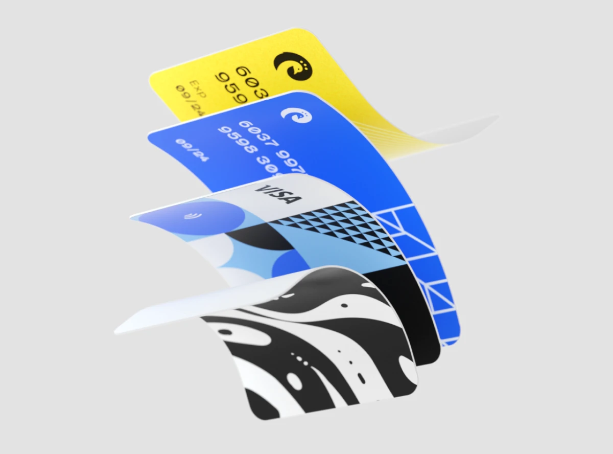
Starting and Growing a Career in Web Design
Starting and Growing a Career in Web Design
Starting and Growing a Career in Web Design
Starting and Growing a Career in Web Design
Research
/
Samuel Kovatski
Research
/
Samuel Kovatski
Research
/
Samuel Kovatski
Research
/
Samuel Kovatski

Source:
Samuel Kovatski
In today's digital age, the demand for skilled web designers continues to soar as businesses strive to establish and enhance their online presence. Whether you're just starting your journey or looking to take your career to new heights, navigating the world of web design can be both exciting and rewarding.
The Roadmap to Starting and Growing a Career in Web Design
Whether you're just starting your journey or looking to take your career to new heights, navigating the world of web design can be both exciting and rewarding. Here's a roadmap to help you kickstart and grow your career in web design.
Embrace the Fundamentals:
Before diving into the complexities of web design, it's essential to grasp the fundamentals. Familiarize yourself with HTML, CSS, and JavaScript – the building blocks of the web. Understanding these core technologies lays a solid foundation for your journey into web design and development.
Invest in Education:
Continuous learning is key to staying relevant in the ever-evolving field of web design. Explore online courses, tutorials, and workshops to enhance your skills and broaden your knowledge. Consider pursuing formal education or certifications to deepen your expertise and credibility in the field.

Source: Samuel Kovatski
Collaboration and Communication: The Cornerstones of Success
Design is a collaborative process. Establish open lines of communication from the outset. Regular team meetings, brainstorming sessions, and feedback loops are vital. Tools like project management platforms, collaborative design software, and communication channels foster a culture of teamwork and ensure everyone is on the same page.
Build a Strong Portfolio
Your portfolio is your best showcase of skills and abilities as a web designer. Start by creating your own website to showcase your work. Include a diverse range of projects that highlight your creativity, problem-solving skills, and attention to detail. Regularly update your portfolio with new projects and experiences to demonstrate growth and progress.
Master Design Principles
Great web design goes beyond aesthetics – it's about creating user-centric experiences that drive engagement and conversions. Dive deep into design principles such as layout, typography, color theory, and user experience (UX) design. Develop a keen eye for detail and strive for designs that are both visually appealing and functional.
Embark on your journey into the exciting and dynamic field of web design with these guiding principles. From mastering the fundamentals to cultivating a growth mindset and building your brand, each step brings you closer to realizing your full potential as a web designer. Embrace the challenges, celebrate the victories, and never stop pursuing your passion for creativity and innovation in web design.
In today's digital age, the demand for skilled web designers continues to soar as businesses strive to establish and enhance their online presence. Whether you're just starting your journey or looking to take your career to new heights, navigating the world of web design can be both exciting and rewarding.
The Roadmap to Starting and Growing a Career in Web Design
Whether you're just starting your journey or looking to take your career to new heights, navigating the world of web design can be both exciting and rewarding. Here's a roadmap to help you kickstart and grow your career in web design.
Embrace the Fundamentals:
Before diving into the complexities of web design, it's essential to grasp the fundamentals. Familiarize yourself with HTML, CSS, and JavaScript – the building blocks of the web. Understanding these core technologies lays a solid foundation for your journey into web design and development.
Invest in Education:
Continuous learning is key to staying relevant in the ever-evolving field of web design. Explore online courses, tutorials, and workshops to enhance your skills and broaden your knowledge. Consider pursuing formal education or certifications to deepen your expertise and credibility in the field.
Source: Samuel Kovatski
Collaboration and Communication: The Cornerstones of Success
Design is a collaborative process. Establish open lines of communication from the outset. Regular team meetings, brainstorming sessions, and feedback loops are vital. Tools like project management platforms, collaborative design software, and communication channels foster a culture of teamwork and ensure everyone is on the same page.
Build a Strong Portfolio
Your portfolio is your best showcase of skills and abilities as a web designer. Start by creating your own website to showcase your work. Include a diverse range of projects that highlight your creativity, problem-solving skills, and attention to detail. Regularly update your portfolio with new projects and experiences to demonstrate growth and progress.
Master Design Principles
Great web design goes beyond aesthetics – it's about creating user-centric experiences that drive engagement and conversions. Dive deep into design principles such as layout, typography, color theory, and user experience (UX) design. Develop a keen eye for detail and strive for designs that are both visually appealing and functional.
Embark on your journey into the exciting and dynamic field of web design with these guiding principles. From mastering the fundamentals to cultivating a growth mindset and building your brand, each step brings you closer to realizing your full potential as a web designer. Embrace the challenges, celebrate the victories, and never stop pursuing your passion for creativity and innovation in web design.
Our work has been featured by:


Let’s talk with us
Contact HeloGensee today, and let's start the conversation about transforming your ideas into extraordinary digital experiences.
Our work has been featured by:
Let’s talk with us
Contact HeloGensee today, and let's start the conversation about transforming your ideas into extraordinary digital experiences.
Our work has been featured by:
Let’s talk with us
Contact HeloGensee today, and let's start the conversation about transforming your ideas into extraordinary digital experiences.
What’s next?

Branding
/
Samuel Kovatski
In today's fast-paced digital landscape, speed is paramount. Whether you're running an e-commerce store, a blog, or a corporate website, optimizing website performance is crucial for success. In this article, we'll explore why speed matters and share practical tips for enhancing your website's performance to deliver an exceptional user experience.
Why Speed Matters:
1. User Experience:
Speed directly impacts user experience. Research shows that users expect websites to load within seconds. A slow-loading website frustrates visitors and increases bounce rates, leading to lost opportunities for engagement and conversions.
2. Search Engine Rankings:
Search engines prioritize fast-loading websites in their rankings. Websites with slow load times may experience lower visibility in search results, reducing organic traffic and hindering overall digital marketing efforts.
3. Conversions and Revenue:
Website speed has a direct correlation with conversions and revenue. Studies have found that even a one-second delay in page load time can result in decreased conversion rates. Faster websites not only improve user satisfaction but also increase the likelihood of visitors converting into customers.
Source: Samuel Kovatski
Tips for Optimizing Website Performance:
1. Minimize HTTP Requests:
Reduce the number of HTTP requests by minimizing the use of external scripts, stylesheets, and images. Combine CSS and JavaScript files, and utilize CSS sprites to reduce the number of image requests.
2. Enable Browser Caching:
Leverage browser caching to store static files locally on users' devices. This reduces server load and speeds up page load times for returning visitors. Configure caching headers to specify how long files should be cached.
3. Optimize Images:
Compress and optimize images to reduce file sizes without compromising quality. Use tools like Photoshop, ImageOptim, or online services like TinyPNG to optimize images before uploading them to your website.
4. Implement Lazy Loading:
Implement lazy loading for images and videos to defer loading until they are needed. This technique prioritizes the loading of content above the fold, improving initial page load times and user experience.
5. Minify and Combine Files:
Minify CSS, JavaScript, and HTML files to remove unnecessary characters, comments, and whitespace. Combine multiple files into a single file to reduce the number of server requests and improve loading speed.
6. Utilize Content Delivery Networks (CDNs):
Utilize CDNs to distribute website content across multiple servers worldwide. CDNs cache content closer to users' locations, reducing latency and improving page load times for visitors regardless of their geographic location.
7. Optimize Server Response Time:
Optimize server response time by upgrading hosting plans, optimizing database queries, and implementing caching mechanisms. Monitor server performance regularly and address any bottlenecks or issues promptly.
8. Leverage Browser-Side Performance Tools:
Utilize browser-side performance tools like Google PageSpeed Insights, GTmetrix, or Pingdom to analyze your website's performance metrics. Identify areas for improvement and implement suggested optimizations to enhance speed and user experience.
Conclusion:
In today's digital era, optimizing website performance is non-negotiable. A fast-loading website not only enhances user experience but also boosts search engine rankings, conversions, and revenue. By implementing the tips outlined in this article, you can ensure that your website delivers optimal performance and remains competitive in the online landscape.

Business
/
Samuel Kovatski
In today's digital age, the variety of devices used to access the internet is staggering – from desktop computers and laptops to smartphones, tablets, and even smart TVs. As such, ensuring that your website looks and functions flawlessly across all these devices is paramount. This is where responsive design comes into play.
What is Responsive Design?
Responsive design is an approach to web design that ensures a website responds dynamically to the size and orientation of the user's screen. Rather than creating multiple versions of a website for different devices, responsive design allows for a single website to adapt fluidly to various screen sizes and resolutions.
Source: Samuel Kovatski
Best Practices for Responsive Design
1. Mobile-First Approach:
Start by designing for mobile devices and then progressively enhance the layout and features for larger screens. This ensures that your website is optimized for the smallest screens first, providing a solid foundation for larger devices.
2. Flexible Grid Layouts:
Use fluid grid layouts that automatically adjust to the size of the user's screen. This allows content to reflow and rearrange based on the available space, maintaining readability and usability across devices.
3. Media Queries:
Implement CSS media queries to apply different styles based on the device's characteristics, such as screen width, resolution, and orientation. This allows you to tailor the presentation of your website for optimal viewing on each device.
4. Optimized Images and Assets:
Optimize images and other assets for fast loading times on mobile devices. Use responsive image techniques, such as srcset and sizes attributes, to deliver the most appropriate image resolution based on the user's device.
5. Usability Testing:
Conduct usability testing across a variety of devices to ensure that your website functions as intended on each platform. Identify any usability issues or layout inconsistencies and address them promptly to deliver a seamless user experience.
Conclusion
Responsive design is no longer a luxury – it's a necessity in today's multi-device landscape. By adopting a responsive design approach, you can ensure that your website is accessible, user-friendly, and future-proofed for the evolving digital landscape. Embrace responsive design principles and craft websites that delight users on every device.